guide
Sagrada Familia Design: Nature, Structure, and Light
The design is not a single gesture
Sagrada Familia can look overwhelming because it refuses to reduce itself to one clean image. The design gathers towers, facades, nave, branching columns, sculptural surfaces, and colored light into a system that must be read in parts. That complexity is not random. Each major piece gives the basilica a different way to connect structure, religious story, and city visibility.
Verticality is transformed
The building inherits the Gothic desire for height, but it does not simply repeat medieval Gothic architecture. Vertical force is filtered through organic geometry and Catalan Modernisme. The towers pull the eye upward, while the columns inside split and branch rather than remaining simple shafts. This makes the upward movement feel grown and engineered at once.
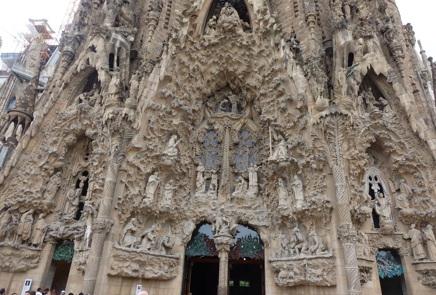
The facades work like chapters
A normal facade can act as a front. Sagrada Familia's facades behave more like chapters in a larger book. Dense sculpture, austere geometry, symbolic figures, and changing surface depth all shape the visitor's emotional reading before entry. The design analysis should therefore ask what each facade is trying to make visible, not only whether the whole building looks ornate.
Structure gives the interior its atmosphere
The interior is powerful because structure and atmosphere are hard to separate. Branching columns organize load while also changing how the nave feels. Light enters through stained glass and turns the structural space into a colored field. The roof, columns, and windows do not act as independent features. They make one continuous spatial argument.
Craft prevents abstraction
Because the basilica carries so much symbolic ambition, it could become abstract or diagrammatic. Craft keeps it physical. Carved surfaces, stone texture, joints, column profiles, glass color, and the shift between older and newer work bring the design back to touch and scale. Close looking is essential because the building's big idea depends on many small decisions.
The design problem is continuity
The long construction history creates a rare design problem: how can a project continue after its original architect while still holding an architectural identity? Sagrada Familia answers through systems rather than one fixed drawing. Geometry, symbolic program, tower hierarchy, facade themes, and interior structure give later work a framework. The result is not seamless, but the tension is part of the reading.
How to test the design from photos
Even without standing inside, photographs can be used critically. A skyline image tests tower hierarchy. A facade image tests symbolic density and surface depth. An interior nave image tests whether the branching columns actually organize the space or only decorate it. A stained-glass image tests how color changes architectural atmosphere. Those four checks keep design analysis grounded in visible evidence instead of broad praise.
Design reading check
A good design analysis should leave the reader with a sequence: read the towers for vertical ambition, the facades for symbolic language, the columns for structural imagination, and the stained glass for atmosphere. That sequence is more useful than saying only that the basilica is ornate, unfinished, or famous.