guide
The Shard Design: Taper, Glass, and Street Pressure
The design depends on a readable silhouette
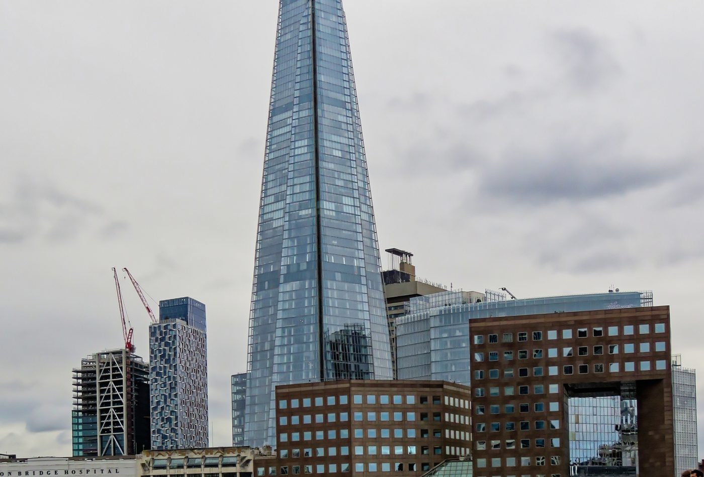
The Shard works first as silhouette. Many towers are remembered as height plus address, but this one is remembered as a sharp vertical figure. Its design uses sloping glass facets to make the mass narrower, lighter, and more directional as it rises. The result is not a neutral stack of floors. It is a tower that wants to be recognized from a train window, bridge crossing, river walk, office district, or postcard skyline.
The crown refuses closure
The upper part is one of the most important design decisions. Instead of finishing as a flat roof, the glass planes rise unevenly and stop with a sense of incompletion. This prevents the tower from reading as a sealed commercial block. It also reinforces the shard metaphor without needing literal decoration. The name and the form support each other because the top looks like fragments continuing into the sky.
Glass is used for edge, reflection, and instability
The facade is not interesting only because it is glass. It is interesting because the glass turns the building into a changing edge. On a bright day, the tower can look pale and sharp. In cloud, it can become almost grey. At night, it shifts toward vertical light. That instability helps the building feel thinner than its size would suggest, but it also makes the tower hard to ignore in historic views.
The base has a harder job than the top
The skyline image is simple; the ground condition is more complicated. The building touches London Bridge Station, surrounding streets, service routes, retail, security, and heavy pedestrian flow. A good design reading should therefore move from top to bottom. The top gives identity, but the base tests whether that identity can survive real urban pressure. The Shard is strongest when the tower is read together with the movement around it.
High-tech without exposed machinery
The Shard belongs near high-tech architecture, but it is not high-tech in the same way as Centre Pompidou or Lloyd's Building. It does not put colorful services on the outside. Its technical expression is more restrained: glass enclosure, steel logic, vertical systems, tight mixed-use stacking, and a precisely controlled profile. That makes it a useful counterexample. High-tech influence can appear as smooth performance and infrastructure coordination, not only as visible pipes.
The tower makes distance part of the design
Some buildings reward close detail more than distant view. The Shard does both, but the distant reading is unusually important. From across the Thames, the building becomes a single mark. From nearby streets, it breaks into glass facets, lobby edges, station pressure, and reflections. The design asks to be judged at multiple distances because its public effect changes with every scale.
Design comparison
Compare The Shard with Burj Khalifa and 30 St Mary Axe. Burj Khalifa uses setbacks and extreme height to stage a metropolitan image. 30 St Mary Axe uses a rounded diagrid form to create compact tower identity. The Shard uses taper, glass planes, and an unfinished crown to make height feel sharp rather than smooth. Those differences make the tower a study in how high-rise identity can be produced without heavy ornament.