guide
Burj Khalifa Design: Buttressed Core and Taper
The design turns height into a sequence
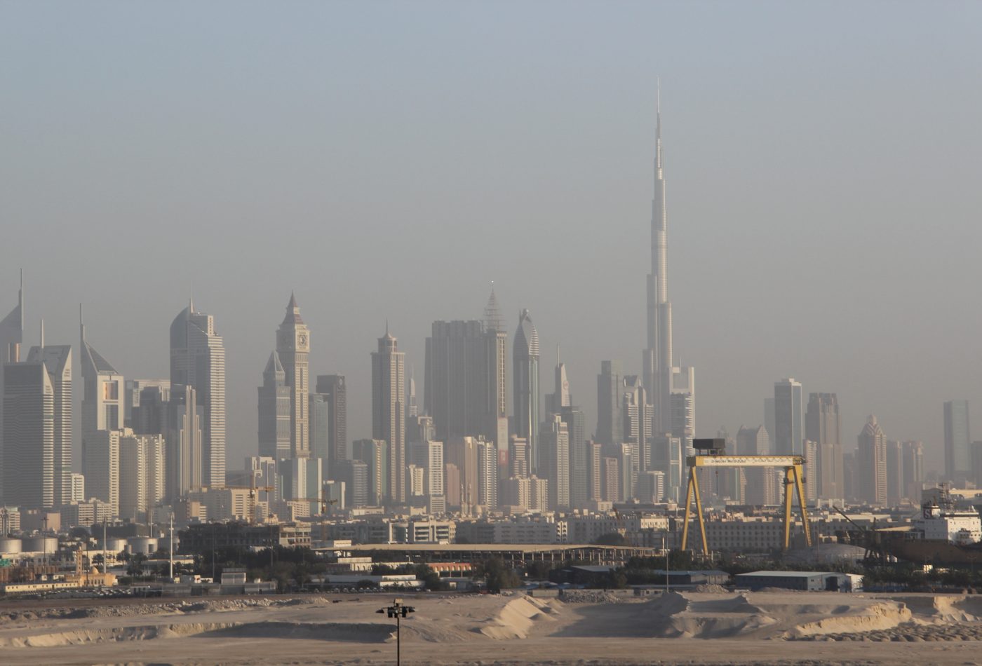
Burj Khalifa is memorable because its height is not expressed as a single extrusion. The tower rises through setbacks, wings, and narrowing tiers, so the eye reads a sequence rather than a blunt vertical slab. This is a design decision with structural, aerodynamic, and visual consequences. The changing profile breaks down an extreme scale and gives the building a rhythm that can be recognized from far across Dubai.
Plan and elevation reinforce each other
The Y-shaped plan is not hidden from the public image. It helps generate the tower's elevation because the wings step back at different heights, producing the spiraling taper. The result is a strong relationship between plan and skyline. Many tall buildings have a memorable outline but an ordinary floor plan; Burj Khalifa is more useful to study because the plan logic and the distant profile are visibly connected.
The buttressed core makes the image credible
The tower's design depends on the buttressed core system. Each wing supports the others around a central core, creating a stable high-rise structure that can keep climbing while reducing the sense of a single vulnerable shaft. This matters architecturally because the public image of lightness depends on heavy structural discipline. The more delicate the tower looks at the top, the more important the hidden and visible logic of support becomes.
Setbacks are more than decoration
The setbacks shape the tower's silhouette, but they also help address wind and floor-plate change. At this height, wind is not a side issue; it is one of the main design conditions. The tower avoids a simple repeated profile that would invite a more predictable wind response. Instead, the stepping form changes the tower's width and edge conditions as it rises. That is why the silhouette should be read as environmental strategy, not only as branding.
The facade performs between desert and skyline
The facade has a difficult role. It must make the tower read as a precise, reflective object while coping with intense sun, heat, dust, and maintenance realities. The material language of glass, metal, concrete, and light produces a cool image in a hot climate. That contrast is part of the design. The tower's apparent smoothness is a carefully managed surface condition rather than a neutral wrapping around floors.
The base tests the tower's urban value
A tower this famous can easily be judged only from a distant view, but the design also has to meet a district. The base connects to water, landscape, plazas, retail approaches, hotel arrival, and pedestrian routes. This ground condition is where height becomes city experience. A useful design analysis should therefore move downward after looking upward. The tower's success depends on whether the skyline symbol can still support public movement and orientation at ground level.
Design comparison
Compare Burj Khalifa with The Shard and Marina Bay Sands. The Shard uses a sharp glass taper to enter a historic skyline; Marina Bay Sands uses a horizontal sky park to bind three towers into one figure; Burj Khalifa uses plan geometry, setbacks, and extreme vertical scale to define a new district image. These comparisons make the tower less generic. It is not only tall; it is a case study in how plan, structure, envelope, and urban ambition make height readable.