guide
Sydney Opera House Design: Shells, Platform, Harbor
The design works by pairing opposites
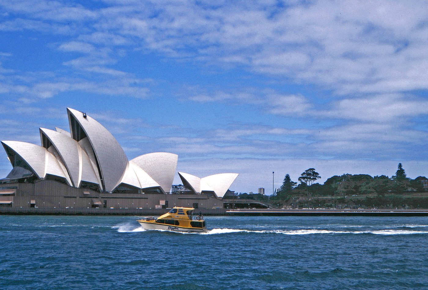
Sydney Opera House is memorable because its main oppositions stay visible. The roof appears light, pale, and almost floating, while the podium is dark, stepped, and heavy. The building reads as both object and landscape: a cluster of shells from the water, then a sequence of stairs, platforms, foyers, and terraces from the ground. That pairing keeps the project from becoming a simple sculptural icon.
The shells create a family, not a front facade
A normal civic building often has one main facade, but this complex avoids that hierarchy. The shells make several strong profiles, each changing as the viewer moves around Bennelong Point. That means the design is cinematic. It is understood through approach, angle, distance, and reflection rather than from a single official elevation. The harbor makes this especially powerful because the building is constantly seen in motion.
Structure became the architectural language
The famous roof was not just a visual idea waiting to be built. Its design depended on finding a geometric system that could turn ambitious competition drawings into repeatable components. The result is architecture where engineering translation becomes part of the story. The shells look expressive, but their credibility comes from the discipline behind their repetition, ribs, edges, and tiling.
The podium controls scale
The podium is easy to overlook because the roof gets most of the attention, yet it is essential to the design. It gathers entrances, stairs, terraces, service areas, and public movement into a constructed base. Without that base, the shells would risk becoming isolated objects. With it, the building has civic weight and a clear relationship to the ground, the harbor walk, and the ceremonial act of arrival.
Material detail keeps the icon alive up close
The design succeeds at long distance, but the close reading matters just as much. The ceramic-tile surface breaks the roof into a fine scale that catches light differently through the day. The glass walls let public foyers face outward. The concrete structure and stone-like platform make the visitor aware of mass and labor. These details stop the building from collapsing into a logo.
How to compare the design
Compare Sydney Opera House with Guggenheim Bilbao and Marina Bay Sands, but do not compare only their silhouettes. Ask how each building turns a cultural or leisure program into a city image. Sydney's answer is more civic and sectional: it separates rooms under shells and grounds them on a public platform. That is different from Bilbao's metallic continuity or Singapore's skyline deck.
The design mistake to avoid
The common mistake is to describe the building only as a set of white sails. That image is useful, but it hides the architecture. The more precise reading asks how separate performance volumes, roof geometry, foyer glazing, ceremonial stairs, service needs, and harbor views are made to appear like one effortless public composition. That is also why the building still rewards sectional drawings, close photographs, and slow walking.