guide
St Peter's Basilica Design: Dome, Facade, and Procession
The design is a sequence, not one view
St Peter's Basilica is weakly described when it is reduced to a dome, a facade, or a famous interior. The design works as a sequence: piazza, facade, nave, crossing, dome, altar, and chapels. Each part changes the visitor's sense of scale and authority. The square gathers the body, the facade declares institution, the nave lengthens movement, and the crossing opens upward. That is the design problem at the center of the building: how to make a huge church legible while moving thousands of people through ceremonial space.
The dome and nave create productive tension
The dome gives St Peter's a centralized image, while the nave creates a longitudinal route. These are not the same design impulse. A pure central plan would draw attention immediately to the crossing; a long basilican plan delays that moment through procession. St Peter's is powerful because it holds both. The visitor moves forward along a long axis, but the building's strongest vertical event waits at the crossing. The result is not a simple compromise. It is a staged drama between direction and center.
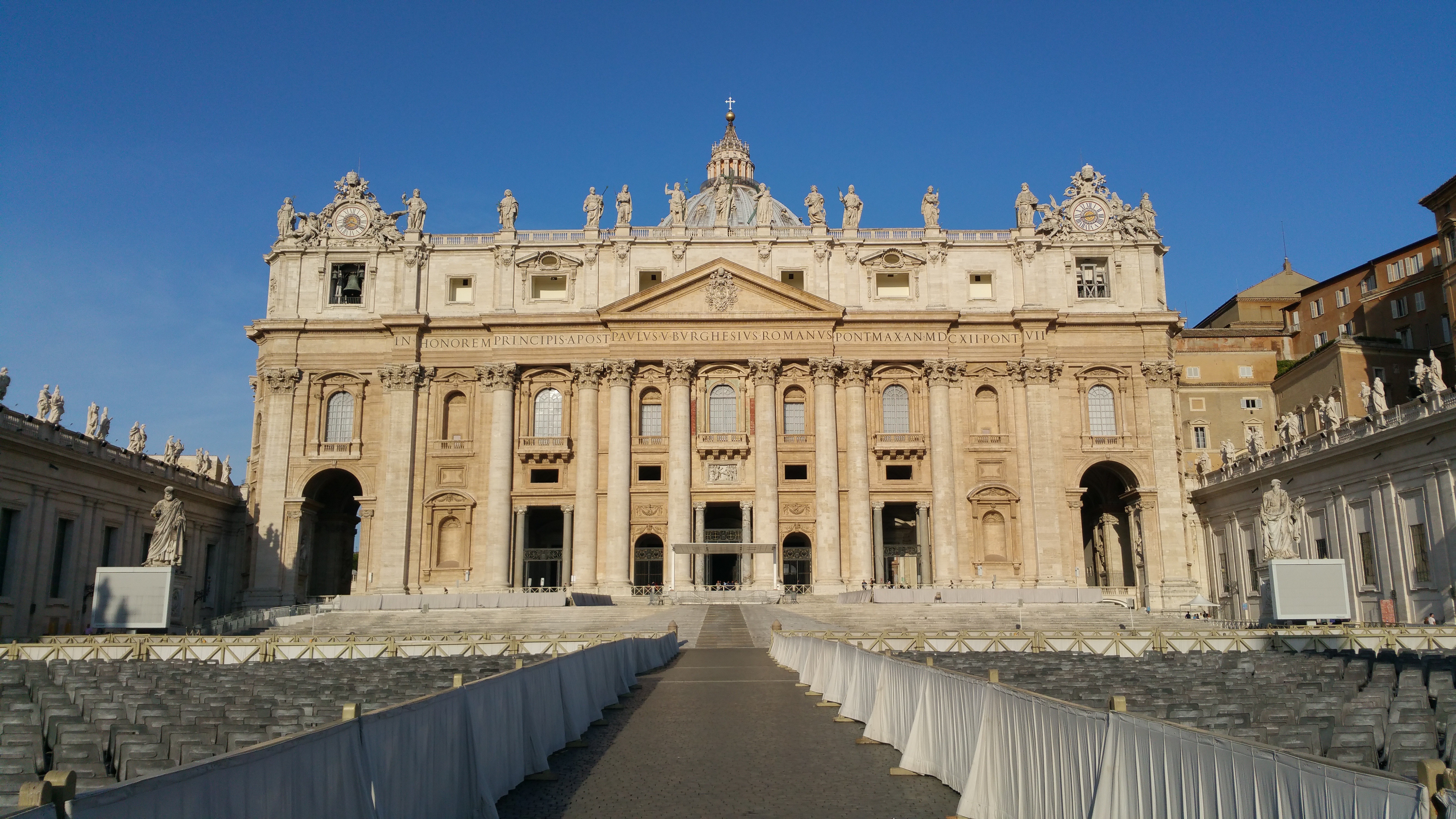
The facade is a threshold machine
Maderno's facade can look like a broad screen in photographs, but on site it is more usefully read as a threshold machine. Its order, balcony, inscription, giant columns, and repeated openings turn public arrival into controlled entry. It also mediates between Bernini's enormous square and the nave inside. That middle role matters. The facade does not need to explain the entire basilica by itself. It has to receive the crowd, hold papal symbolism, and prepare a body for the change of scale beyond the doors.
Bernini's piazza extends the plan outdoors
The piazza is not decorative urban space added after the real architecture. It extends the design outdoors. The colonnades shape lateral enclosure, the oval manages crowd gathering, and the axis connects city approach to church front. Bernini's move is architectural because it gives the basilica a public room before the interior room. Without the square, the facade would be read more abruptly. With the square, the building begins before the threshold and turns arrival itself into part of the design.
Material richness needs spatial discipline
Inside the basilica, marble, bronze, gilding, sculpture, pavement, inscriptions, and light can overwhelm a first-time viewer. The design holds that richness through order. Piers, bays, chapels, vaults, and the central crossing keep the eye from dissolving into decoration. This is the difference between accumulation and architecture. St Peter's uses lavish material culture, but the spatial system keeps it readable. The visitor can move from one episode to another without losing the larger route.
The design lesson is controlled magnitude
The basilica's most useful lesson is controlled magnitude. Everything is large, but size alone would not make the building coherent. The square controls public scale, the facade controls institutional image, the nave controls procession, the crossing controls vertical release, and the dome controls memory. The parts do not all say the same thing. They divide the problem of monumentality into manageable stages. That is why St Peter's is more instructive than a generic statement about grandeur.
Design comparison
Compare St Peter's with Hagia Sophia and St Paul's Cathedral. Hagia Sophia makes mass feel suspended through dome, light, and layered sacred history. St Paul's uses a layered dome to serve both London skyline and interior worship. St Peter's is different because the dome belongs to a much larger papal procession and an outdoor urban theater. Its value is not only the dome as object, but the way dome, nave, facade, and square turn authority into movement.