guide
Marina Bay Sands Design: Towers, Deck, and Waterfront
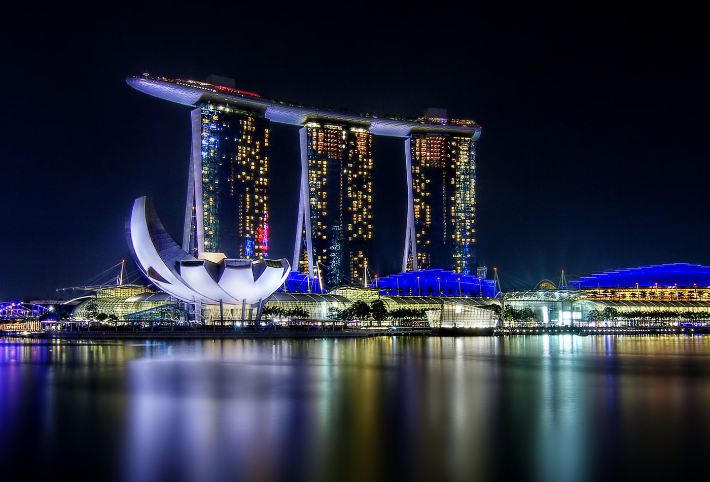
The design is a simple diagram made enormous
Marina Bay Sands works because its basic diagram can be understood quickly: three towers below, one long SkyPark above. That simplicity is not a weakness. It lets an enormous mixed-use complex become legible from across the bay. The design problem is how to make repetition, height, commercial program, and skyline spectacle read as one composition rather than as separate pieces of resort infrastructure.
The SkyPark edits the towers
The three towers would be strong but ordinary without the top deck. The SkyPark edits them into a single figure. It creates a horizontal counterweight to the vertical slabs and gives the building its most memorable proportion. The deck also changes how weight is perceived. Instead of making the top disappear, the design makes the top deliberately heavy and visible, turning the skyline into a balancing act.
Section is more important than facade
Many buildings are read mainly through facade rhythm, but Marina Bay Sands is best read through section. The useful question is what happens at different heights: public approach and retail below, hotel rooms in the towers, leisure and viewing functions above, and the bay as the wide urban room around it. The facade matters, but it is the vertical arrangement of program that makes the building architecturally distinct.
The waterfront makes the diagram public
The design depends on distance. Across Marina Bay, the towers and SkyPark become a clean silhouette that can be photographed, remembered, and used as a city marker. From closer routes, the building becomes more complex: podium edges, hotel arrivals, retail thresholds, convention circulation, and waterfront movement compete with the famous outline. The design succeeds when those distant and close readings still feel connected.
Commercial program becomes civic image
One of the important design tensions is that the project is commercial but widely read as part of Singapore's public image. The resort program is not civic in the same way as an opera house or museum, yet the bay-facing composition gives it a civic presence. The architecture turns leisure, gambling, hospitality, shopping, and convention infrastructure into a skyline emblem. That transformation is the key design issue, and it should be judged carefully rather than praised automatically.
Structure is visible as confidence
The SkyPark gives the project structural drama even when a visitor does not know the engineering details. Its long horizontal mass appears to bridge and overhang above the towers, making the top feel like a constructed landscape in the air. The visual confidence of that move is central to the building's identity. The structure is not exposed in a high-tech way, but its scale and position are unmistakable.
Design comparison
Compare Marina Bay Sands with Sydney Opera House and Burj Khalifa. Sydney uses roof geometry and harbor setting to create a cultural civic image. Burj Khalifa uses plan, taper, and extreme height to define a district. Marina Bay Sands uses a horizontal sky park across vertical hotel towers to turn a commercial waterfront complex into a single skyline figure. The comparison shows why the building should be read through section and city image, not only through novelty.