guide
Guggenheim Museum Bilbao Design: Curves, Atrium, and River
The design works through controlled disorder
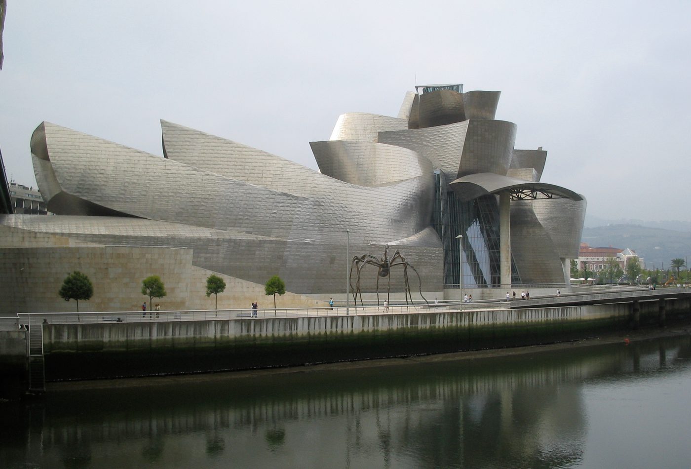
Guggenheim Museum Bilbao looks irregular, but the design is not random. Its power comes from controlled disorder: curving titanium forms, stone blocks, glass slots, bridge edges, river views, and gallery volumes are brought into one composition without becoming symmetrical. The museum refuses the calm frontality of a traditional art museum. Instead, it makes approach, reflection, overlap, and surprise part of the design language.
There is no single best facade
The building changes as the viewer moves around it. From the river, it becomes a metal landscape of folds and reflections. From city approaches, stone and glass make the museum feel more grounded and institutional. From near the bridge, the scale shifts again because infrastructure becomes part of the frame. This multi-sided quality is central to the design. It makes the museum cinematic rather than simply frontal.
Titanium gives movement to a still building
The titanium skin is the clearest design device because it turns weather into architecture. The panels do not need bright sun to work; in grey light they can look soft, matte, or almost fabric-like. In stronger light, the surface becomes sharper and more reflective. That changing behavior supports the museum's curving geometry. A rigid material is made to feel fluid because scale, paneling, and reflection keep the eye moving.
Digital modeling is part of the design reading
The museum belongs to a moment when digital tools helped architects translate complex geometry into buildable information. That does not mean the computer designed the building. It means the computer helped coordinate a design that would have been far harder to document, price, fabricate, and assemble through older methods alone. The result is important because the visible expression and the production method are linked. The form advertises a new relationship between design imagination and construction control.
The atrium gives orientation inside the spectacle
The central atrium keeps the building from becoming only a sequence of confusing shapes. It gathers movement and lets visitors understand where galleries, stairs, lifts, bridges, and views sit in relation to one another. The atrium is therefore not a neutral lobby. It is the spatial hinge between the museum's sculptural outside and its functional inside. Without that organizing room, the exterior drama would have less architectural credibility.
The museum uses the city as a material
Water, bridges, nearby buildings, streets, and former industrial memory all participate in the design. The museum does not only occupy a site; it edits the site into a new public image. This is why photographs from the river are so persistent. They show the building using reflection and infrastructure to enlarge its presence. The city becomes part of the composition, just as titanium and glass do.
Design comparison
Compare Guggenheim Bilbao with Sydney Opera House and Centre Pompidou. Sydney turns a harbor cultural building into a civic silhouette; Centre Pompidou turns technical systems and public movement outward; Bilbao turns sculptural surface and riverfront regeneration into a museum identity. The comparison shows why Bilbao should not be described only as strange or shiny. Its design links form, construction method, material behavior, and urban strategy.