why it matters
Why this building matters
It shows how a small corner building can become a symbol through form, movement, and city contrast.
building detail
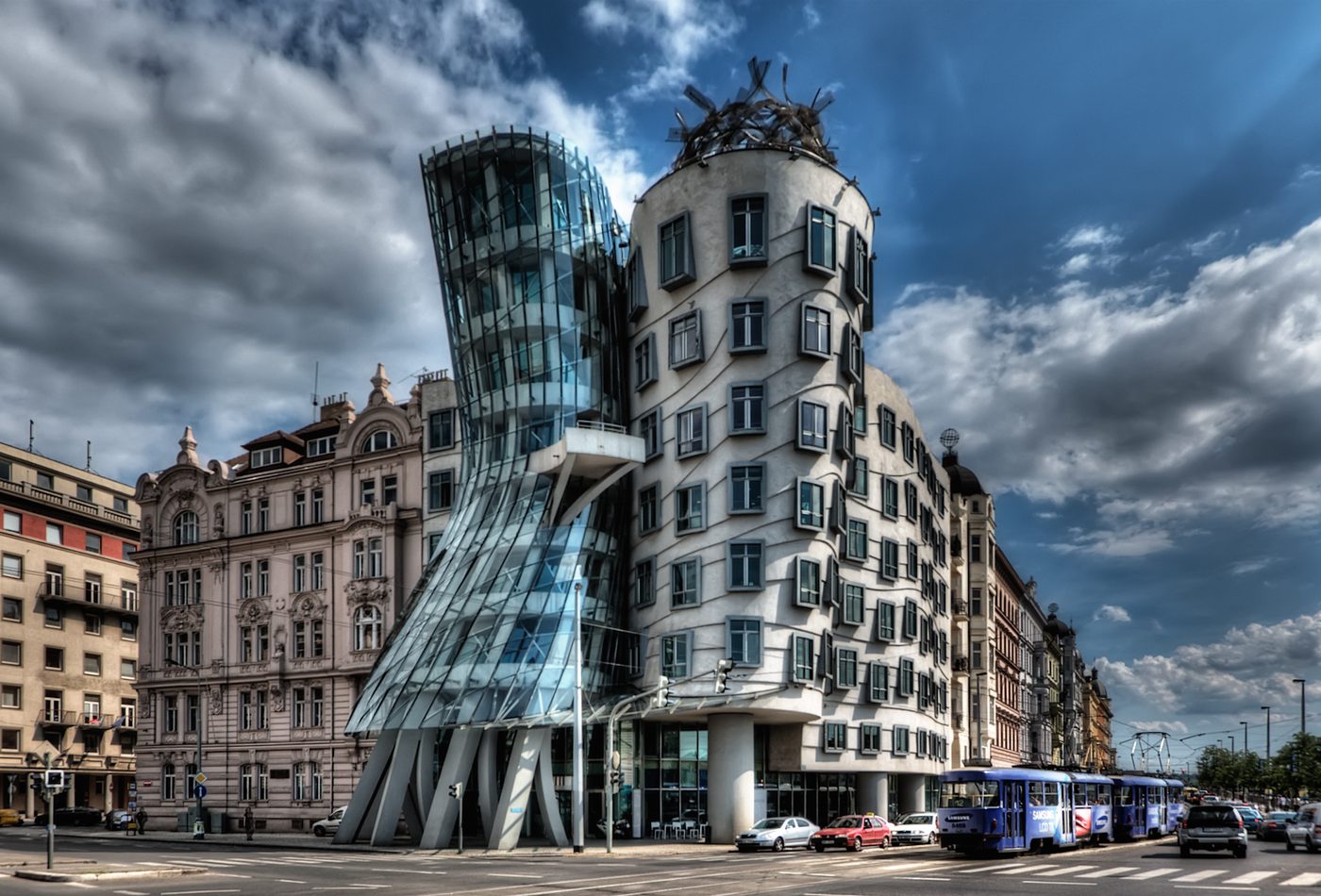
A Prague office building famous for two towers that appear to lean and dance.
Photo credit: Wikimedia Commons contributor / CC BY-SA 2.0.
why it matters
It shows how a small corner building can become a symbol through form, movement, and city contrast.
what to notice
explore by place and style
map notes
Use the coordinates as anchors for reading the buildings in relation to streets, water, skyline, and nearby landmarks.
50.0755, 14.414243.2686, -2.934048.8606, 2.3522Map coordinates are listed with provider attribution handled through the source records.
architecture guide
A fuller reading of the building's history, setting, form, materials, and public role.
Dancing House is an office building in Prague completed in 1996, but the fact that matters first is its corner site. The building does not sit in an open field where a sculptural object can be judged alone. It presses into a street wall near the river and turns a tight urban corner into a public image. That setting explains why the leaning forms feel so forceful: the design is arguing with the regularity of the surrounding city fabric.
The building's famous image comes from a pair of volumes. One is more solid, with pushed and angled window lines; the other is glassy, compressed, and visibly in motion. The nickname suggests dancing figures, but the architectural reading should be more precise. The design uses contrast between mass and transparency, stillness and movement, street wall and twist. The two parts make the corner legible from a distance and more complex up close.
The date places the project in post-1989 Prague, when contemporary architecture could become part of a city strongly associated with historic continuity. That does not mean the building is important only because it is unusual. It matters because it shows how a new office building could carry cultural symbolism through form. The design made a small commercial program visible inside a larger debate about modern Prague.
The material palette includes glass, concrete, and steel, but the key is how those materials separate the two figures. Glass makes one tower lighter and more exposed. Concrete gives the other mass and surface depth. Steel supports the more delicate gestures and crown-like top. Together they let the building read as a pair without losing the discipline needed for a working office building on a real corner lot.
Start with the glass tower's compressed waist, the angled window rhythm of the more solid tower, and the way the building turns the corner. Those details make the concept visible. The building is not simply bent for effect. Its value comes from how movement is controlled, where the body seems to tighten, how the facade keeps a relation to the street, and how the top prevents the composition from becoming too smooth.
Use the basic facts to avoid a shallow reading. The type tells you this is an office building, so its theatrical form had to coexist with leasable space and urban frontage. The date tells you it belongs to a specific moment in Prague's recent architectural history. The materials tell you how transparency and solidity divide the paired figures. The site tells you why the building's movement feels public rather than private.
A useful fact sheet should help the reader see why Dancing House is more than a novelty. If the page leaves only the nickname, it has failed. The better reading connects the nickname to a corner site, two-part massing, material contrast, post-communist urban context, and the careful difference between controlled distortion and arbitrary shape.
Dancing House can look playful at first, but the stronger design reading is about controlled movement. The building bends, narrows, and leans without turning the corner into pure spectacle. That balance matters. A small office building cannot rely on scale alone; it has to make its argument through massing, facade rhythm, material contrast, and the relationship between two figures pressed into a compact urban site.
The glass tower is the most visibly unstable part of the composition. Its compressed waist and transparent skin make it read less like a standard office volume and more like a figure caught in motion. Yet it still marks the corner clearly. This is the project's main design tension: the tower disturbs the street wall while also giving the corner a memorable vertical marker. It is disruption used as orientation.
The second tower is more massive, but it is not simply background. Its angled windows and pushed surfaces keep it in conversation with the glass volume. It gives the composition weight and prevents the design from floating away from the street. The contrast between these two bodies is what makes the project readable. One seems to pull, the other seems to hold, and the corner becomes the stage between them.
Many office buildings use repeated windows to signal efficiency and order. Dancing House bends that expectation. Windows still repeat, but their angles and alignments keep the eye moving. The facade rhythm therefore becomes a design tool, not only a functional requirement. It lets the building acknowledge ordinary office use while making that ordinariness visually unstable. The result is expressive without needing a large footprint.
Glass, concrete, and steel each clarify part of the design. Glass makes compression and transparency visible. Concrete gives the heavier tower a body. Steel supports thin edges and the crown-like top. This material contrast prevents the building from reading as one distorted lump. The viewer can separate the figures, compare their behavior, and understand the building as a relationship rather than a single shape.
The building's impact depends on its city setting. In a different context, the same form might feel like an isolated novelty. In Prague, against more continuous historic fabric, the controlled distortion becomes sharper. The design asks how contemporary architecture can make itself visible without requiring a huge site or monumental program. It turns a corner into a debate about continuity, contrast, and public memory.
The project is useful because it stays small enough for its distortions to be tested against ordinary street evidence. Doorways, office floors, window spacing, and neighboring cornice lines keep pulling the composition back toward practical building. That restraint matters. If the same formal idea were enlarged without control, it could become a disconnected object. At this scale, the viewer can see the negotiation between theatrical movement and the everyday work of holding a corner.
A good design analysis should not stop at the word deconstructivist. The reader should be able to explain how the glass tower, solid tower, window rhythm, corner turn, and top detail work together. The building's value is not that it is strange. Its value is that strangeness is organized into a readable urban composition.
Dancing House matters historically because it made a modest office building carry a visible argument about Prague's contemporary identity. The building did not need a huge program to become famous. It used a corner site, paired volumes, and a strong contrast with older urban fabric to ask whether new architecture in Prague should blend into inherited form or make a clear break. That question is the real historical context.
The building belongs to post-1989 Prague, a period when the city was re-entering international cultural and economic circuits after the end of communist rule. Contemporary design could become a signal of openness, risk, and change. That does not mean every unusual form from the period was automatically successful. Dancing House became memorable because its image was simple enough to circulate and its site was prominent enough to make the debate public.
The dancing nickname is not just a marketing label. It gave non-specialists a way to remember the form. Architecture often enters public memory through names, stories, and comparisons as much as through drawings. The risk is that the nickname can flatten the building into a joke. The more useful reading treats the nickname as an entry point, then asks how the paired bodies, materials, and corner condition produce the sense of movement.
The building's contrast with Prague's historic image made it controversial and visible. That controversy is not separate from the architecture. It reveals the expectations placed on buildings in a city known for layered historical character. The project asks whether a new building should be polite, quiet, contextual, theatrical, or deliberately disruptive. Its value lies in making that question concrete on a single street corner.
As an office building, Dancing House has a practical commercial program. As a landmark, it performs a different role. It gives tours, postcards, architecture students, and city guides a contemporary counterpoint to Prague's older monuments. This second role explains why the building is remembered out of proportion to its size. It became a symbol of architectural change because people kept using it to talk about newness in an old city.
The legacy of Dancing House should be handled carefully. It is not proof that every historic city needs an attention-grabbing object. It is proof that a small contemporary building can become a public reference point when form, site, story, and timing align. Its limitation is the same as its strength: the building is easy to reduce to a nickname. Good historical reading should keep the broader urban and cultural question visible.
The history should change how the building is seen. The leaning glass tower should no longer look only playful; it should read as a public sign of post-1989 openness and debate. The stone and glass contrast should no longer look like decoration; it should read as a visible negotiation between Prague's inherited image and a new architectural language.
Start by reading Dancing House from the street corner, not as a freestanding sculpture. The building's energy comes from how it turns the corner and interrupts a more regular urban edge. Stand far enough back to see both volumes at once. The useful question is not simply whether the building looks like dancers. The better question is how movement is created within the limits of a compact city site.
Look separately at the glass tower and the heavier tower. The glass body appears compressed and transparent; the other body feels more anchored but still distorted through its windows and surface. Move your eye back and forth between them. The building becomes clearer when the viewer treats it as a duet of different weights, not as one strange facade.
The windows are a practical way into the design. They reveal how ordinary office repetition has been bent into a more animated rhythm. From some angles the window lines seem to lean or slide; from others they reconnect with the street wall. This is where the building's theatrical image meets its everyday use. A visitor who studies only the overall silhouette misses that smaller discipline.
Dancing House needs its neighbors. The contrast with more regular facades makes the movement sharper. Take a moment to look at the surrounding street before looking back at the corner. The building's effect depends on a visual before and after: the city sets an expectation, then Dancing House bends it. That relationship is more informative than an isolated close-up.
At street level, look for the moments where the expressive image has to become a usable building. The base, entries, glass edge, and heavier wall all have to negotiate pedestrian scale. This is where the visit becomes more than a photograph. A successful reading should explain how the building keeps its theatrical identity while still making a corner, holding a frontage, and giving the passerby enough clues to understand where the volumes begin and end.
First, make a wide corner view that includes neighboring buildings. Second, make a vertical view of the glass tower's compressed waist. Third, isolate the angled windows or the top detail of the heavier body. These three photographs preserve context, figure, and detail. They also prevent the visit from becoming only a repetition of the most common postcard angle.
After visiting or studying Dancing House, compare it with Guggenheim Museum Bilbao, Centre Pompidou, or Sydney Opera House. Each makes a public argument through a form that was not initially neutral. Dancing House is smaller and more street-bound than those examples, but that is exactly why it is useful. It shows that architectural memorability can come from a precise corner condition, not only from monumental scale.
Give the visit a simple order: street context first, whole corner second, glass body third, solid body fourth, window rhythm last. This route keeps the reading architectural. It lets the visitor move from city contrast to form, then from form to detail. The building becomes more convincing when its apparent joke is tested against actual facade decisions.
continue reading
related buildings
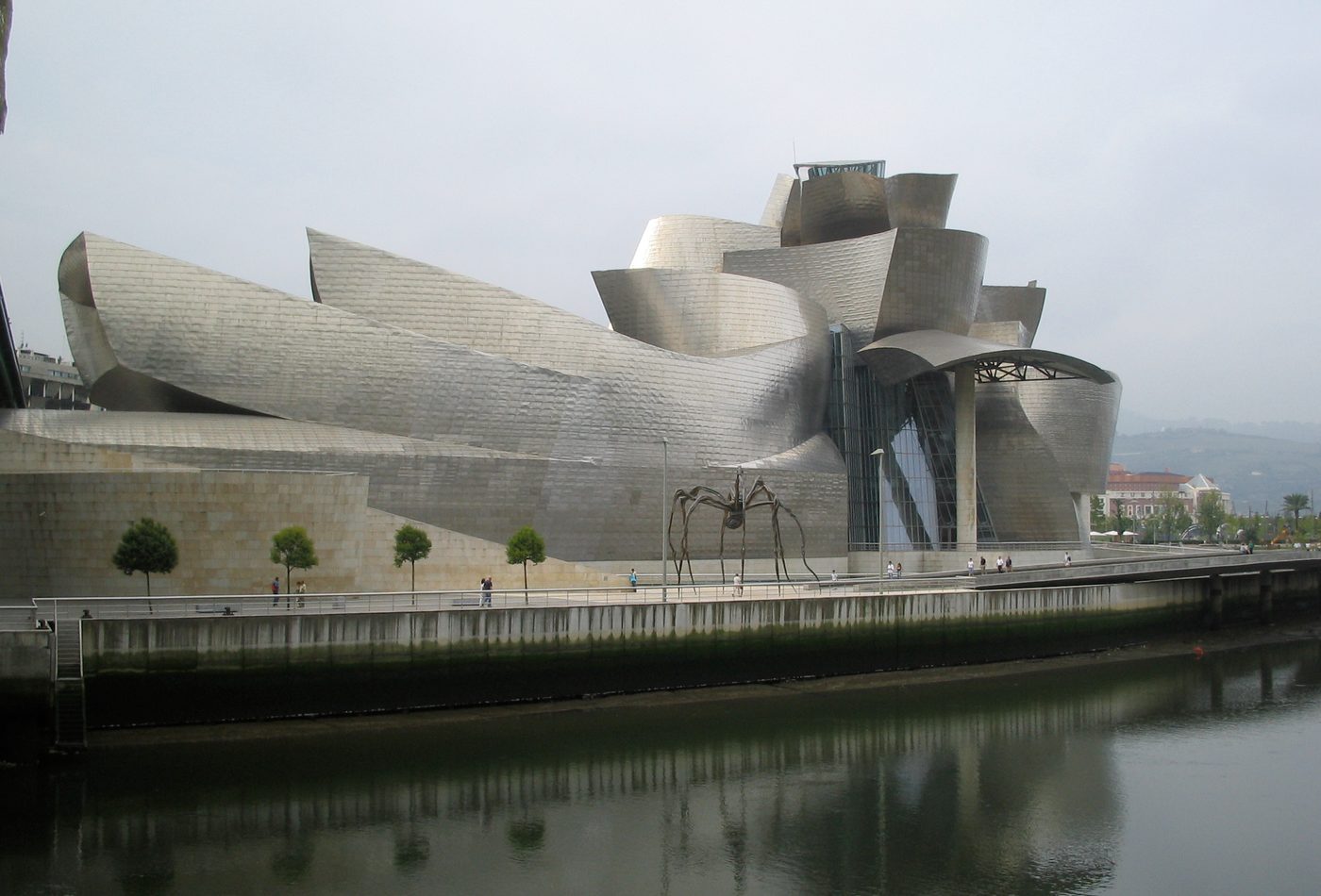
A museum known for titanium curves and the urban renewal story often called the Bilbao effect.
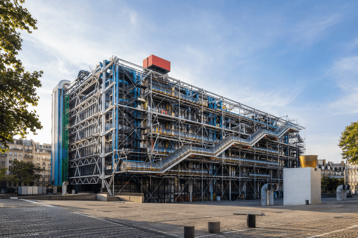
A cultural center famous for putting structure, escalators, and services on the outside.
References used for facts, location data, image credits, and architectural context on this page.