guide
Dancing House Design: Motion on a Tight Site
The design is movement under control
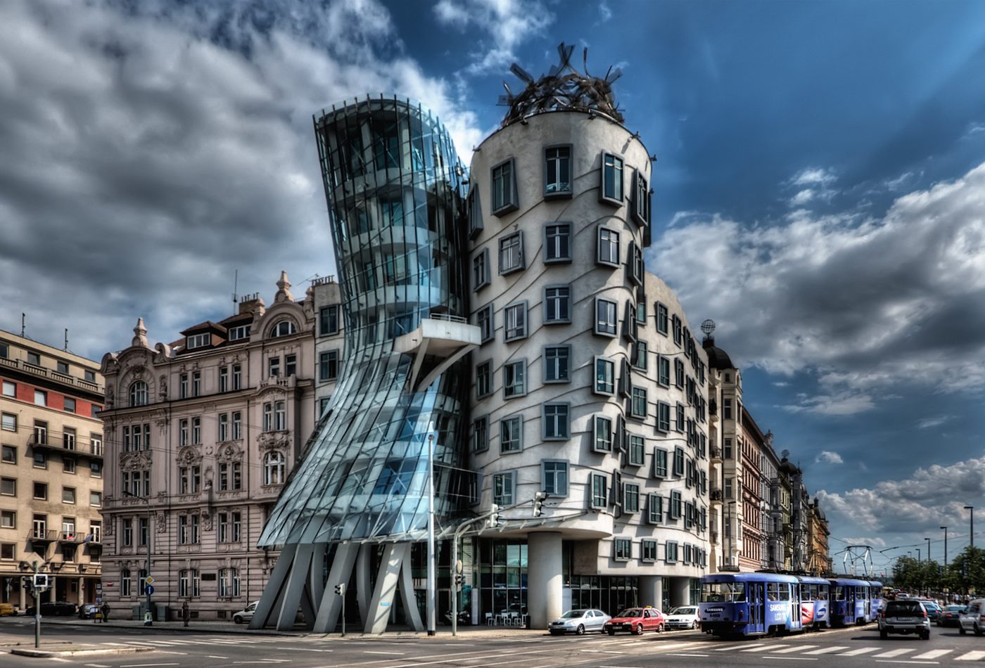
Dancing House can look playful at first, but the stronger design reading is about controlled movement. The building bends, narrows, and leans without turning the corner into pure spectacle. That balance matters. A small office building cannot rely on scale alone; it has to make its argument through massing, facade rhythm, material contrast, and the relationship between two figures pressed into a compact urban site.
The glass body changes the corner
The glass tower is the most visibly unstable part of the composition. Its compressed waist and transparent skin make it read less like a standard office volume and more like a figure caught in motion. Yet it still marks the corner clearly. This is the project's main design tension: the tower disturbs the street wall while also giving the corner a memorable vertical marker. It is disruption used as orientation.
The solid body keeps the building anchored
The second tower is more massive, but it is not simply background. Its angled windows and pushed surfaces keep it in conversation with the glass volume. It gives the composition weight and prevents the design from floating away from the street. The contrast between these two bodies is what makes the project readable. One seems to pull, the other seems to hold, and the corner becomes the stage between them.
Facade rhythm replaces ordinary repetition
Many office buildings use repeated windows to signal efficiency and order. Dancing House bends that expectation. Windows still repeat, but their angles and alignments keep the eye moving. The facade rhythm therefore becomes a design tool, not only a functional requirement. It lets the building acknowledge ordinary office use while making that ordinariness visually unstable. The result is expressive without needing a large footprint.
Material contrast makes the idea legible
Glass, concrete, and steel each clarify part of the design. Glass makes compression and transparency visible. Concrete gives the heavier tower a body. Steel supports thin edges and the crown-like top. This material contrast prevents the building from reading as one distorted lump. The viewer can separate the figures, compare their behavior, and understand the building as a relationship rather than a single shape.
Urban design effect
The building's impact depends on its city setting. In a different context, the same form might feel like an isolated novelty. In Prague, against more continuous historic fabric, the controlled distortion becomes sharper. The design asks how contemporary architecture can make itself visible without requiring a huge site or monumental program. It turns a corner into a debate about continuity, contrast, and public memory.
Scale is part of the discipline
The project is useful because it stays small enough for its distortions to be tested against ordinary street evidence. Doorways, office floors, window spacing, and neighboring cornice lines keep pulling the composition back toward practical building. That restraint matters. If the same formal idea were enlarged without control, it could become a disconnected object. At this scale, the viewer can see the negotiation between theatrical movement and the everyday work of holding a corner.
Design reading check
A good design analysis should not stop at the word deconstructivist. The reader should be able to explain how the glass tower, solid tower, window rhythm, corner turn, and top detail work together. The building's value is not that it is strange. Its value is that strangeness is organized into a readable urban composition.