guide
Florence Cathedral Design: Dome, Marble, and Campanile
The design problem was larger than a facade
Florence Cathedral is often remembered through its decorated front or its red-tiled dome, but the design problem was bigger than either image. The cathedral had to hold an enormous sacred interior, occupy a dense urban site, relate to the baptistery and campanile, and finish a crossing that earlier builders had left as a major technical challenge. A design reading should therefore start with scale and completion: how does a long cathedral project become a coherent public monument?
The dome makes engineering visible
Brunelleschi's dome is the central design event because it turns a construction problem into the building's public identity. The octagonal form, high profile, ribs, lantern, and tiled surface make the dome legible from outside the cathedral and across Florence. It is not an invisible technical solution hidden behind a roof. It becomes the monument's skyline argument. The dome tells the city that a difficult span has been solved and made beautiful.
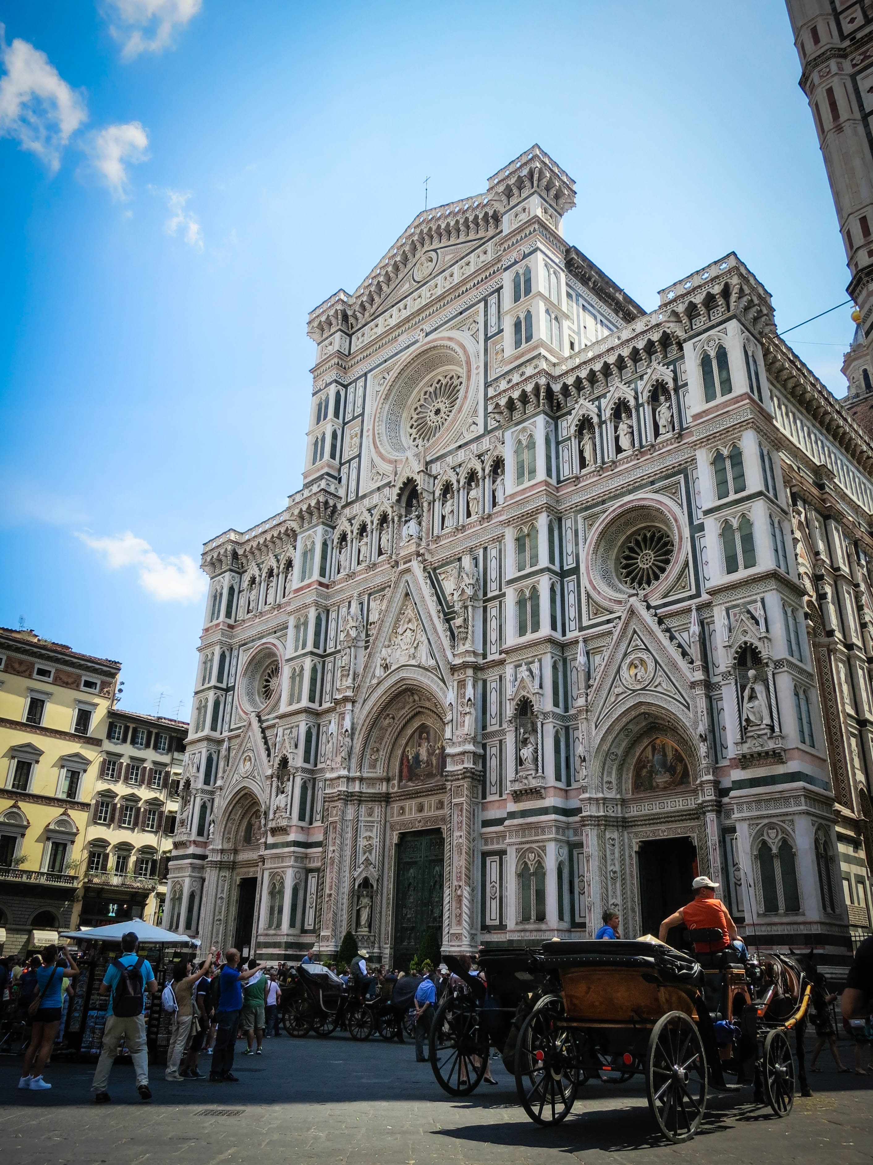
The facade works by layered framing
The facade should be read as a layered graphic and sculptural system. Marble colors draw frames around portals, arches, rose windows, gables, and niches. Instead of one flat decorated wall, the front is a hierarchy of openings, panels, figures, edges, and shadows. This is why the facade rewards close looking even if the dome dominates from afar. It gives the pedestrian a different scale from the skyline view.
The campanile changes the composition
Giotto's campanile matters because it prevents the cathedral from reading as a single isolated mass. The tower gives the complex a vertical counterpoint to the long nave and broad dome. From the piazza, the eye moves between facade, bell tower, dome, and surrounding street edges. This distributed composition is important: Florence Cathedral is not one centralized object like the Pantheon. It is a set of related architectural bodies forming a civic room. The tower also gives visitors a measuring device for scale, because its patterned vertical face can be compared directly with the cathedral wall.
Material pattern mediates size
Polychrome marble makes a very large cathedral readable at human scale. The pattern gives the surface a measured rhythm, while sculpture and portals create points of focus. Brick and stone carry a different kind of meaning: they are tied to mass, structure, and construction. The design succeeds because material does not do one job. It handles appearance, scale, structure, craft, and memory through different surfaces and positions.
Interior and exterior do not tell the same story
The exterior is visually dense, but the interior experience depends more on volume, direction, and the sense of a vast body leading toward the dome. That contrast is part of the design reading. The facade prepares the visitor through surface complexity, while the cathedral body asks the visitor to understand length, height, nave rhythm, and the spatial pull toward the crossing. The dome then gathers that movement upward. A good analysis keeps surface and section in conversation, because the building's public image and interior route depend on each other.
Gothic and Renaissance are both visible
Florence Cathedral is not best understood by forcing it into one style label. Gothic ambition appears in the cathedral's scale, vertical energies, pointed forms, and decorative density. Renaissance force appears in the dome's geometry, engineering confidence, and civic self-consciousness. The building is a conversation across time rather than a single moment. That layered quality is one reason it feels richer than a tidy textbook example.
The design lesson
The design lesson is that a landmark can be completed across generations without losing architectural force. Florence Cathedral works because later interventions did not merely cover earlier work; they intensified the public reading. The dome gives the city a profile, the facade gives the piazza a detailed front, the campanile anchors the complex, and the material palette ties scale to close inspection. A strong analysis keeps all four in view and asks how each one changes the others.