guide
Colosseum Design: Vaults, Seating, and Crowd Movement
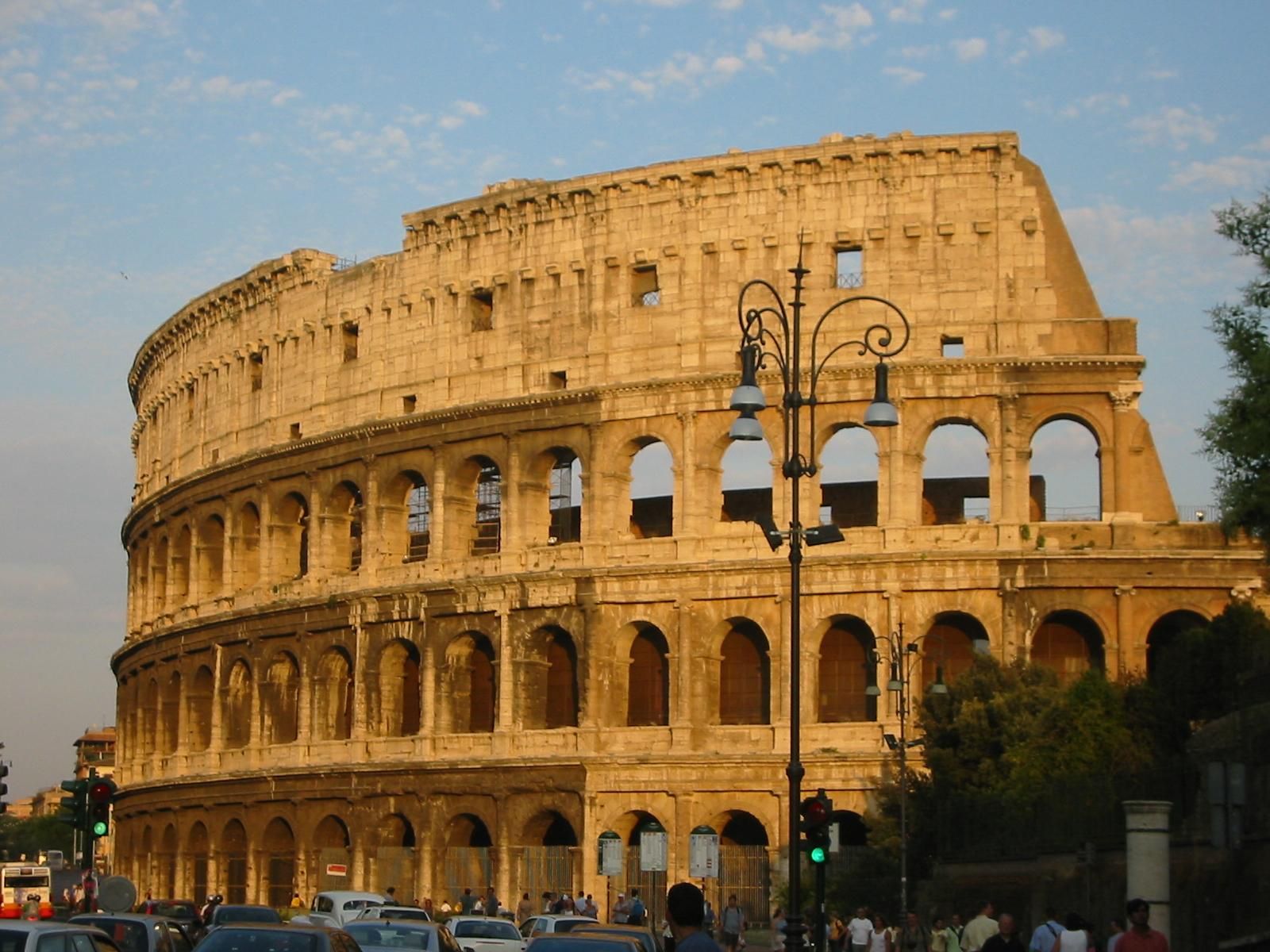
The design works as a crowd machine
The Colosseum is best analyzed as a crowd machine: architecture for movement and collective attention. Its oval plan focuses sightlines on the arena, while the outer envelope, entrances, corridors, stair systems, and seating tiers distribute people around the building. That combination is the design. The amphitheater is not only a symbolic ruin. It is evidence of how Roman architecture could organize thousands of bodies through geometry, repetition, and hierarchy.
The exterior turns structure into public order
The facade has a disciplined order because repeated arches make the enormous building legible. Each bay gives a measurable unit, while the stacked levels create a vertical rhythm. The classical orders and the changing wall treatment do not simply decorate the building. They give visual structure to a massive envelope and communicate civic control. The ruin still works because enough of that order remains visible.
Vaults make the building thick
A flat reading of the Colosseum sees only the outside curve. A better design reading notices thickness. Behind the outer arcades are corridors, radial walls, vaults, stairs, and seating supports. These spaces allow the building to handle load and circulation together. The amphitheater is therefore both shell and network. Its architecture lies in the depth between the public facade and the arena edge.
Material choice supports the hierarchy
Travertine gives the exterior a durable public face, while tuff, brick, and concrete support internal structure and vaulting. This material hierarchy matters because it separates image, load, enclosure, and circulation. The Colosseum does not rely on one material doing everything. It combines construction methods so the building can be monumental outside, efficient inside, and adaptable enough to support a complicated seating and service system. Reading the material changes also keeps the amphitheater from becoming a flat postcard: the public face, hidden passages, repaired edges, and exposed voids each tell a different part of the design story.
The ruin exposes the design
The Colosseum's damaged state is part of how modern viewers understand it. Missing wall sections, exposed corridors, and visible substructures reveal relationships that would once have been partly hidden. The ruin makes the amphitheater more diagrammatic. Visitors can see the difference between outer skin, seating support, circulation, arena edge, and underground service zones. That exposure turns decay into architectural evidence.
Urban position changes the reading
The building's design cannot be separated from its place in Rome. It stands among roads, archaeological remains, slopes, and monuments that make the amphitheater part of a larger public landscape. The exterior arcades work at city scale: they are visible from approach routes, frame movement around the site, and keep the building recognizable even when seen obliquely. The city constantly tests the building's legibility.
Why the shell is only the first layer
The common mistake is to treat the Colosseum as a famous old shell. A sharper reading asks how the shell, vaults, stairs, seating, material hierarchy, and arena work together. The building's power is not only that it survived. It is that survival still makes the original design logic readable: mass public entertainment turned into stone, concrete, arcades, circulation, and controlled spectacle. The most useful design question is therefore not simply what remains, but what the remaining fabric reveals about entrance, hierarchy, visibility, service, and the management of a crowd that had to feel both ordered and excited.