guide
Aqua Tower Lakeshore East Viewing Notes
Start from enough distance
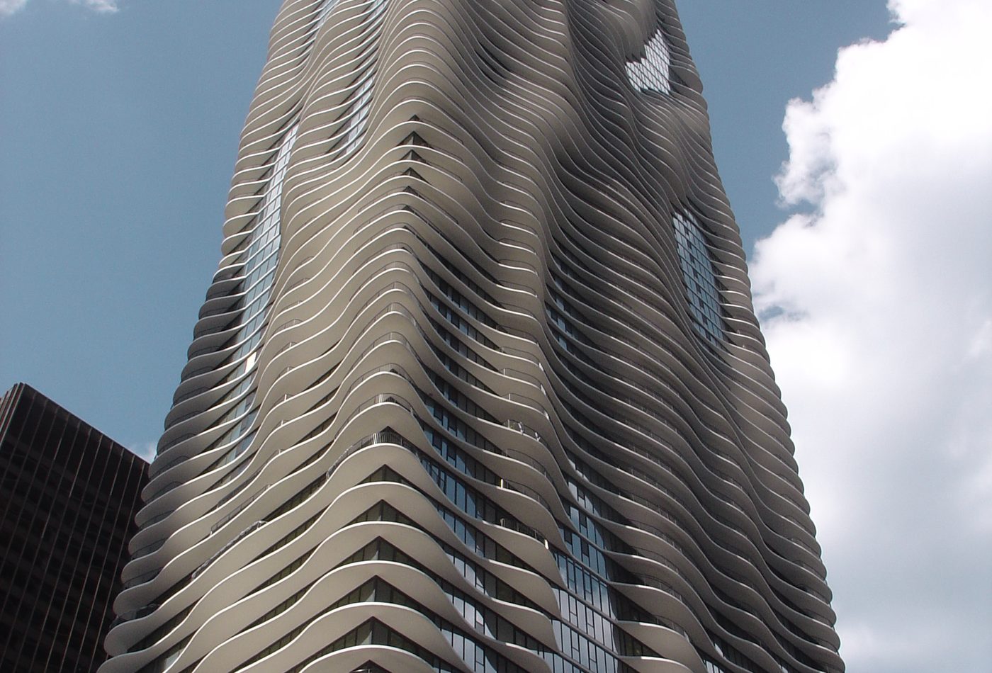
The best first read of Aqua Tower is not from directly under the facade. Begin from enough distance to see the full balcony field. From that range the tower's rectangular mass and rippling edges can be understood together. The important observation is the tension between a simple high-rise volume and an irregular perimeter. If you start too close, the facade becomes a set of fragments. If you start too far, the balcony depth can flatten. Find a distance where the shadow pattern is legible.
Then move closer to the balcony edges
After the wide view, move closer and study the concrete balcony edges. Look for how projections change from floor to floor. Some edges seem to swell outward; others pull back toward the glass. This is where the building stops being a skyline image and becomes architecture. The edge is not a line drawn on the facade. It is a slab with thickness, underside, shadow, and usable outdoor space. Close looking should make that physical depth clear.
Watch the shadows instead of only the outline
Aqua changes with sun and weather because the projecting balconies cast shadows on the glass wall. Those shadows are often the best evidence of how the design works. Look for places where the facade appears darker, deeper, or more layered. The building's famous ripple is not only an outline against the sky. It is also a changing shadow system. A useful visit should record that change rather than relying on one postcard view.
Read it in the Lakeshore East setting
Aqua should also be read through its district. Look at how the tower meets nearby streets, park space, other high-rises, and pedestrian routes. The tower's image is strong from a distance, but the base and neighborhood context explain its role as a mixed-use building. Ask how it behaves as part of a district, not only as an isolated object. The question is whether the expressive tower surface helps orientation and identity at ground level as well as in skyline photographs.
Use comparison while you look
If you know The Shard or Marina Bay Sands from the atlas, use them as quick comparison tools. The Shard is easier to read as a single tapering skyline mark. Marina Bay Sands is easier to read as three towers joined by a deck. Aqua is subtler because its identity is distributed across many balcony decisions. This comparison helps a visitor avoid judging the building only by height or spectacle. Its design power is cumulative.
Make three kinds of photographs
A good visual study of Aqua should include three kinds of image. First, make a distant view that shows the whole tower and the rippling edge. Second, make a mid-range image where the balcony shadows and glass plane are both visible. Third, make a contextual image with neighboring towers, street edges, or park space. Those three views tell a better architectural story than a single zoomed facade crop because they connect skyline image, material depth, and urban setting.
Leave with one design question
The most useful question after seeing Aqua is simple: where does the building's image come from? If the answer is only wavy balconies, the reading is too thin. A stronger answer connects outdoor living, views, shade, wind, glass, concrete, district identity, and Chicago's high-rise culture. That is why Aqua rewards slow looking. It turns a very common building part into a larger argument about how towers can be expressive without depending only on height, crown, or facade pattern.