why it matters
Why this building matters
It shows how balconies can become both usable space and the primary architectural expression.
building detail
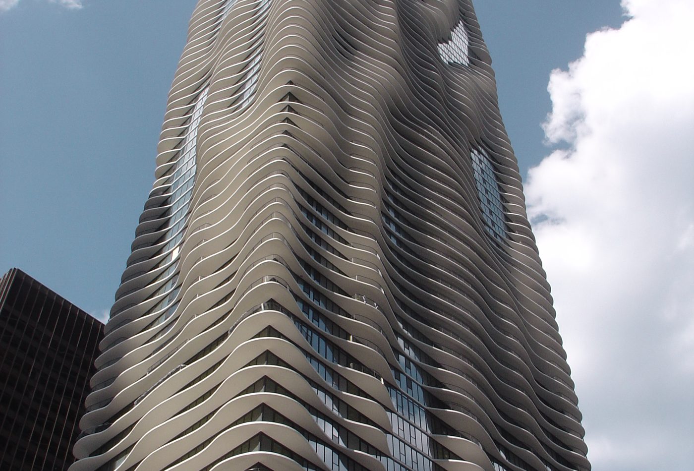
A Chicago tower known for wave-like balconies that make the facade appear to ripple.
Photo credit: Wikimedia Commons contributor / CC BY 2.0.
why it matters
It shows how balconies can become both usable space and the primary architectural expression.
what to notice
explore by place and style
map notes
Use the coordinates as anchors for reading the buildings in relation to streets, water, skyline, and nearby landmarks.
41.8864, -87.620651.5045, -0.08651.2834, 103.8607Map coordinates are listed with provider attribution handled through the source records.
architecture guide
A fuller reading of the building's history, setting, form, materials, and public role.
Aqua Tower is usually recognized before its plan or program is understood because the balconies make the tower look as if it is moving. The building is a tall rectangular structure in Chicago, completed in 2009, but the visible fact that matters first is the irregular concrete balcony field. Those slab edges project, recede, thicken, and thin from floor to floor. They make the facade read less like a flat curtain wall and more like a vertical topography. A useful fact page should start there because the balconies are not decoration added after the tower is solved. They are the main architectural reading tool.
The building is associated with Studio Gang and Jeanne Gang, and that authorship matters because the tower does not treat balconies as repetitive apartment extras. The balcony shapes respond to several practical pressures: views toward city and water, outdoor space, solar exposure, wind, and privacy between neighboring units. That means the famous ripple is produced by use as well as image. The facade looks fluid because individual residential and hotel conditions vary, not because a simple graphic wave was pasted onto a generic high-rise.
Aqua Tower stands in the Lakeshore East area of Chicago, where high-rise housing, hotel use, park space, streets, and nearby water all shape the viewing experience. It is not an isolated object on a blank skyline. From some points the tower is read against other Chicago high-rises; from others it is read through the neighborhood scale of entries, park edges, and pedestrian movement. The tower's surface helps it stand out in a city already famous for tall buildings. That is the urban problem Aqua had to solve: how can another tower in Chicago earn a distinct presence without ignoring the discipline of high-rise construction?
Aqua is a mixed-use tower, so the building has to contain several kinds of occupancy rather than one simple stack. Its public identity comes from the exterior, but its architectural difficulty comes from coordinating hotel, residential, amenity, parking, and ground-level conditions inside one vertical system. The balconies help the residential parts feel individual, while the glass and base conditions connect the tower to the larger district. Treating the project only as a sculptural facade misses this mix of program, real estate, and urban address.
The material reading is simple but important. Glass gives the tower its high-rise skin, reflection, and city-light character. Concrete gives the balcony edges their mass, shadow, and readable depth. The contrast matters because the ripple would be much weaker if it were only a surface pattern printed on glass. The projecting slabs create real shadows and real outdoor space. In photographs, those shadows often explain the building better than color does. The facade changes with light because the balcony edges are physical, not just graphic.
Aqua Tower belongs in the core atlas because it teaches a contemporary high-rise lesson: a repeated residential element can become the identity of the whole building when it is shaped by use, climate, view, and city image. Compare it with The Shard and Marina Bay Sands. The Shard turns a commercial tower into a sharp skyline figure; Marina Bay Sands binds several towers with a horizontal SkyPark; Aqua turns hundreds of balcony decisions into one memorable surface. That makes it valuable for readers who want to understand how ordinary building parts can become architectural argument.
Aqua Tower is most interesting because it begins with a repetitive high-rise problem and then refuses to let repetition become flat. Many residential towers stack similar floor plates and balconies until the facade becomes predictable. Aqua uses the repeated balcony as the place where difference enters the system. Each projection can answer a local condition: a view to open, a neighbor to screen, a balcony to enlarge, shade to cast, or a wind condition to soften. The result is not random. It is variation inside a disciplined tower frame.
A common mistake is to describe Aqua as a wavy facade and stop there. The wave matters because it has depth. The concrete balcony slabs project from the glass skin and produce shadows that change through the day. That thickness makes the elevation legible from a distance and useful up close. A printed pattern or decorative cladding could imitate movement, but it would not give residents outdoor space, shade the glass, or create the same shadow field. Aqua's architectural strength is that image and section are tied together.
The balconies also work as environmental devices. Their projections can reduce direct sun on parts of the facade, create outdoor rooms, and shape how wind is felt near occupied edges. The building's best design lesson is not that every tower should look organic. It is that a familiar element can do several jobs at once. At Aqua, the balcony is amenity, facade, shading device, privacy edge, and skyline identity. When one part carries that many roles, the building becomes more coherent than a tower with a separate decorative gesture.
The glass curtain wall is easy to treat as background because the balconies dominate photographs, but the glass is essential to the design. It provides the continuous vertical plane that makes the balcony projections readable. Without the contrast between flat glass and irregular concrete edge, the ripple would lose clarity. The glass also ties the tower to the broader language of Chicago high-rises: reflection, height, repetition, and city light. Aqua is therefore both familiar and strange. It belongs to the glass tower family while bending that family through slab geometry.
Aqua is also often discussed through its attention to birds and glass visibility. In a city with lakefront migration routes and many reflective towers, a high-rise facade is not only a human image. It can become part of an environmental problem. The project is useful because it keeps that issue within the architectural reading instead of separating it as a technical add-on. Balcony depth, texture, and more visible glass conditions make the tower less like a sheer invisible wall. That does not turn the building into a simple ecological solution, but it does make the facade more responsible and more interesting.
Compare Aqua Tower with The Shard and Marina Bay Sands through how each building creates identity. The Shard uses taper, sharpness, and skyline height. Marina Bay Sands uses the dramatic horizontal SkyPark across three towers. Aqua uses repeated local balcony decisions to create a collective surface. That difference matters for design analysis. Aqua is not trying to win by height alone or by a single crown. It works through accumulated small variations that the eye reads as one larger movement.
Aqua Tower matters historically because it enters a city where the tall building is already a deep tradition. Chicago does not need a tower to prove that high-rise construction is possible. The question for Aqua was different: how can a contemporary tower add something meaningful to a skyline shaped by steel frames, glass walls, commercial towers, residential slabs, and architectural experimentation? Its answer was to make the edge of the floor plate carry the building's identity. That gives the project a place in Chicago's high-rise story without merely repeating older structural expression.
The building also belongs to the history of Lakeshore East as a planned urban district. Its importance is not only that it is tall or photogenic. It helps mark a part of central Chicago where residential life, hotel use, park space, retail, streets, and access to water are compressed into a new urban image. Aqua's rippling surface gives that district a recognizable vertical marker. The building is therefore both a private mixed-use development and a public-facing piece of city identity.
Studio Gang and Jeanne Gang are central to the building's historical meaning because Aqua made a broad public audience notice a different kind of high-rise authorship. The tower did not rely only on height, corporate branding, or a spectacular top. It used a pragmatic residential element, the balcony, as the source of expression. That move helped make the project part of a wider discussion about how contemporary architecture can connect environmental reasoning, user experience, and strong visual identity.
Balconies are often treated as secondary amenities in residential buildings. Aqua changed that reading by making balcony shape the first thing most people remember. Historically, this matters because it turns an ordinary domestic feature into an urban-scale subject. The balcony is no longer just a private outdoor ledge. It becomes a public silhouette, a shading device, a sign of unit difference, and a way to soften the apparent rigidity of a high-rise. That is why the building is studied beyond Chicago.
Aqua's image is easy to imitate poorly. Once the wave becomes famous, later projects can borrow curved balcony edges without carrying the same relationship to view, exposure, use, and environmental performance. That is the main historical risk: the building can be reduced to a style cue. A good history page should resist that reduction. Aqua is important not because a tower can be made wavy, but because the wave is tied to real high-rise questions.
Compare Aqua with older Chicago high-rise lessons and with newer global icons. Older Chicago towers often make structure, frame, or commercial order visible. The Shard makes skyline sharpness and taper visible. Marina Bay Sands makes a whole resort diagram visible. Aqua makes the inhabited edge visible. That historical placement is more useful than treating it as a novelty image. The building records a moment when high-rise design could be judged through facade performance, resident experience, environmental awareness, and city image together.
The best first read of Aqua Tower is not from directly under the facade. Begin from enough distance to see the full balcony field. From that range the tower's rectangular mass and rippling edges can be understood together. The important observation is the tension between a simple high-rise volume and an irregular perimeter. If you start too close, the facade becomes a set of fragments. If you start too far, the balcony depth can flatten. Find a distance where the shadow pattern is legible.
After the wide view, move closer and study the concrete balcony edges. Look for how projections change from floor to floor. Some edges seem to swell outward; others pull back toward the glass. This is where the building stops being a skyline image and becomes architecture. The edge is not a line drawn on the facade. It is a slab with thickness, underside, shadow, and usable outdoor space. Close looking should make that physical depth clear.
Aqua changes with sun and weather because the projecting balconies cast shadows on the glass wall. Those shadows are often the best evidence of how the design works. Look for places where the facade appears darker, deeper, or more layered. The building's famous ripple is not only an outline against the sky. It is also a changing shadow system. A useful visit should record that change rather than relying on one postcard view.
Aqua should also be read through its district. Look at how the tower meets nearby streets, park space, other high-rises, and pedestrian routes. The tower's image is strong from a distance, but the base and neighborhood context explain its role as a mixed-use building. Ask how it behaves as part of a district, not only as an isolated object. The question is whether the expressive tower surface helps orientation and identity at ground level as well as in skyline photographs.
If you know The Shard or Marina Bay Sands from the atlas, use them as quick comparison tools. The Shard is easier to read as a single tapering skyline mark. Marina Bay Sands is easier to read as three towers joined by a deck. Aqua is subtler because its identity is distributed across many balcony decisions. This comparison helps a visitor avoid judging the building only by height or spectacle. Its design power is cumulative.
A good visual study of Aqua should include three kinds of image. First, make a distant view that shows the whole tower and the rippling edge. Second, make a mid-range image where the balcony shadows and glass plane are both visible. Third, make a contextual image with neighboring towers, street edges, or park space. Those three views tell a better architectural story than a single zoomed facade crop because they connect skyline image, material depth, and urban setting.
The most useful question after seeing Aqua is simple: where does the building's image come from? If the answer is only wavy balconies, the reading is too thin. A stronger answer connects outdoor living, views, shade, wind, glass, concrete, district identity, and Chicago's high-rise culture. That is why Aqua rewards slow looking. It turns a very common building part into a larger argument about how towers can be expressive without depending only on height, crown, or facade pattern.
continue reading
related buildings
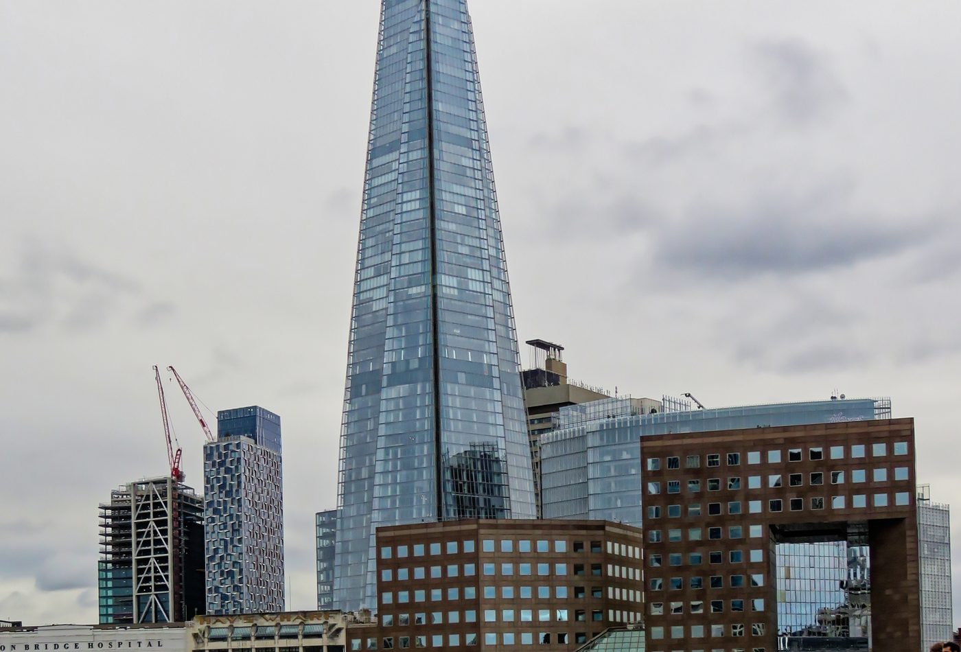
A tapered glass skyscraper that reshaped London's skyline around London Bridge.
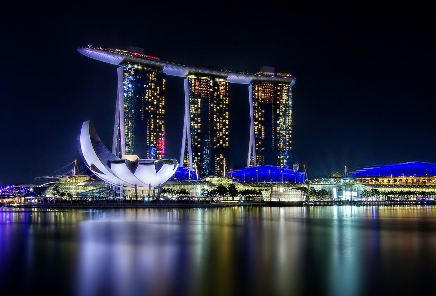
A three-tower integrated resort with a long sky park across the top.
References used for facts, location data, image credits, and architectural context on this page.