guide
Leaning Tower of Pisa Design: Circular Arcades and Unstable Ground
The design is disciplined before it is strange
The Leaning Tower of Pisa works visually because the underlying design is disciplined. The building is a clear cylinder wrapped in repeated galleries, columns, arches, and cornice lines. That regularity gives the eye a stable system to read. The lean then interrupts that system without destroying it. The result is stronger than a purely irregular object, because the viewer can see order and failure at the same time.
A cylinder removes the normal front
The circular plan means the tower has no single privileged facade. Visitors can walk around it and keep encountering the same arcade logic. This is important for a freestanding bell tower in an open field. It must work from changing angles rather than from one ceremonial approach. The lean also changes as the viewer moves, so the design asks for circulation around the object, not just one photograph from the lawn.
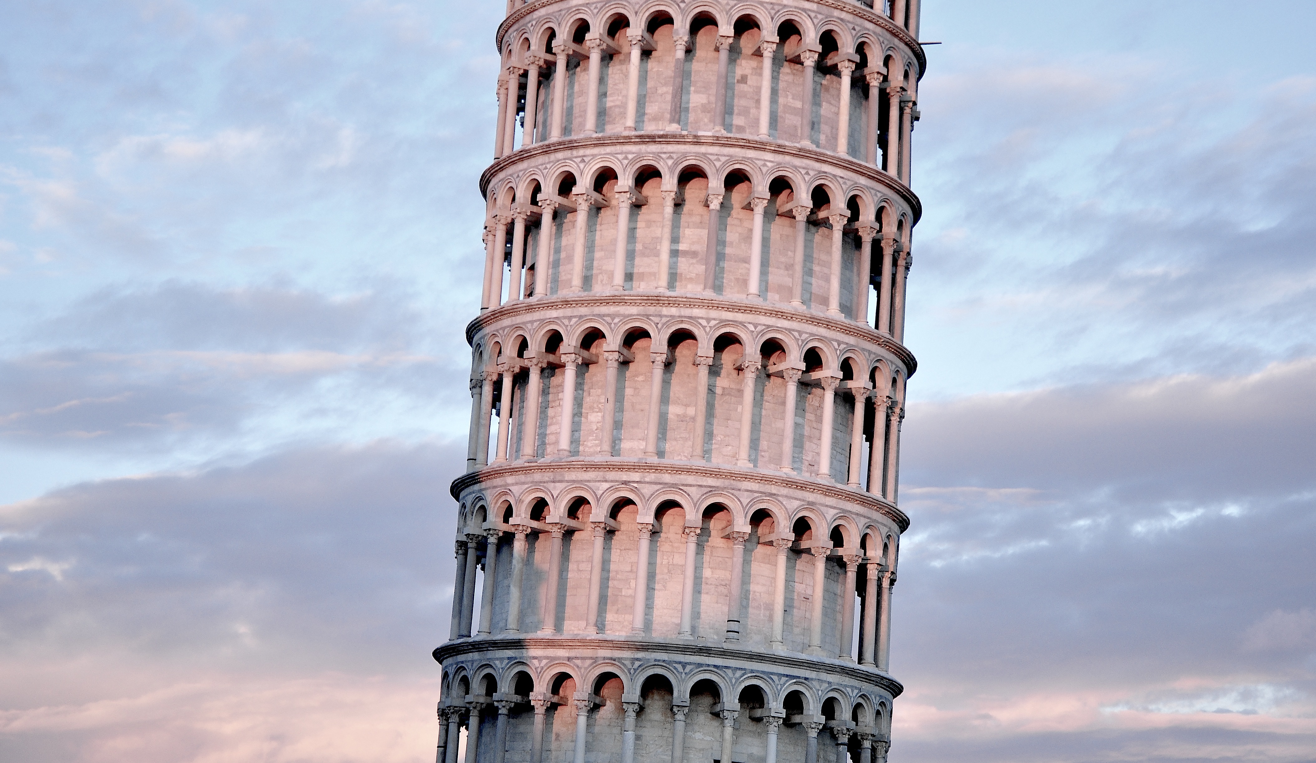
Stacked galleries control scale
The tower could have felt like a plain shaft, but the stacked galleries break height into readable levels. Each ring of columns and arches gives the body a human-scale rhythm. The viewer can count, compare, and follow the vertical sequence upward. This modular reading softens the tower's mass while still preserving its height. The galleries make the building architectural rather than merely cylindrical.
The lean turns repetition into evidence
Because the galleries repeat, the lean becomes easier to understand. The eye expects vertical alignment and horizontal stability. Instead, it sees a consistent arcade system carried off axis. That is the central design drama. The tower is not famous simply because it tilts; it is famous because the tilt happens to a building whose order makes the deviation visible. The design becomes evidence of the ground problem.
Decoration and structure stay close
On the tower, ornament cannot be treated as surface noise. The columns, arches, and bands are also the parts that help viewers understand load, level, and rhythm. They give the tower a fine-grained structure of shadows and openings. This is why close views matter. From far away the lean dominates; from near the base, the repeated openings reveal how carefully the body is organized.
The precinct supplies contrast
The tower's design becomes sharper when read beside the cathedral and baptistery. All three share a pale material world and a Romanesque language of rounded forms, but the tower is the one where instability becomes unavoidable. The ensemble therefore creates a controlled comparison. The cathedral reads as length and wall, the baptistery as centered mass, and the tower as vertical rhythm pulled away from vertical certainty.
Conservation became part of the design reading
Modern stabilization changed the way the tower is understood. A visitor is not only looking at medieval construction; they are looking at a heritage object whose famous defect had to be preserved without letting it become dangerous. That makes the tower a rare case where conservation protects not only material fabric, but also a visible structural condition. The lean is both problem and identity.
The design lesson
The design lesson is that architecture can become memorable through conflict between intention and condition. The intended order is clear: circular body, repeated arcades, bell-tower height, and precinct harmony. The ground condition disrupts that order. Instead of erasing the architecture, the disruption makes the architecture more legible. The tower teaches that a flaw can become meaningful only when there is enough design order for the flaw to be read.