guide
Torre Glories: rounded profile and pixel skin
Quick orientation
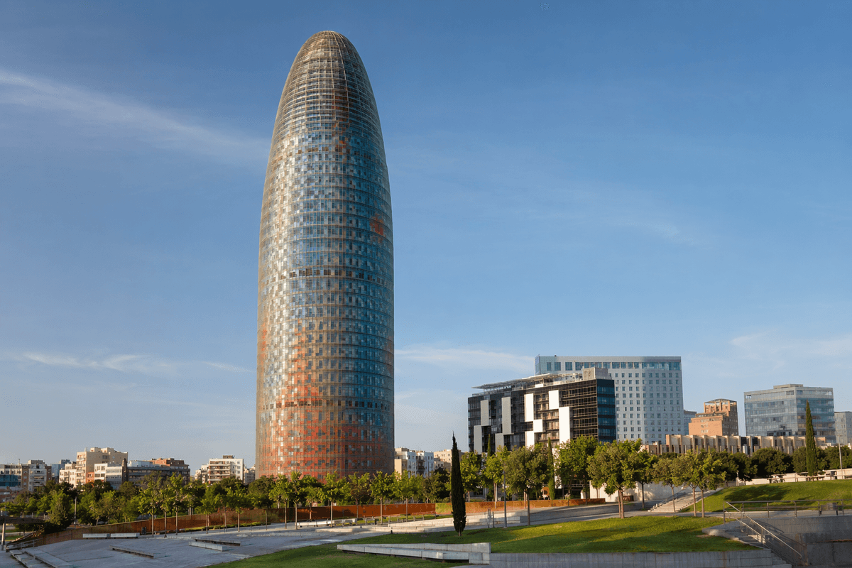
Torre Glories is a office tower in Barcelona, Spain. The atlas records it with a year marker of 2005, a material palette of glass, aluminum, and concrete, and a style reading of Contemporary Architecture. That framing matters because the building is not just a name on a list; it is a visible case study in how architecture turns structure, program, site, and public memory into a built object. The fastest way to read it is to start with the basic facts, then connect those facts to what a visitor can actually see. Its map point is approximately 41.4036, 2.1894, which helps place the building within its city rather than treating it as an isolated postcard image.
Year, type, and place
Torre Glories is cataloged as a office tower, and that type matters because it sets expectations for scale, access, circulation, and symbolic role. A office tower usually has to manage more than an exterior image: it organizes arrival, movement, program, and a public-facing story. In Barcelona, the building also participates in a wider urban pattern, so the best reading connects the landmark to surrounding streets, open space, water, transit, or skyline views.
Style and material facts
The style tags for this page are Contemporary Architecture. They are not labels for decoration; they are reading tools. Use them to look for the building's ordering system, structural expression, surface treatment, and relationship to historical precedent. The main materials recorded here are glass, aluminum, and concrete. Materials shape color, shadow, construction logic, maintenance, and how the building changes in different weather or daylight.
What to notice first
For a first scan, look for rounded tower profile, colored facade pixels, and urban marker at Glories. These features are the fastest entry points because they reveal how the building works before the deeper history is explained. If you can identify those elements on site or in photos, you can move from recognition to interpretation: why the massing takes that shape, why the structure is exposed or hidden, and why the facade meets the city in a particular way.
Why the fact sheet matters
Architecture facts can feel flat when they are disconnected from the experience of the building. This page keeps the facts tied to visible evidence. The year tells you when the design entered architectural history; the city tells you what urban pressures surrounded it; the style tells you which design language to test; and the materials tell you how the idea became physical. That is the difference between memorizing a landmark and actually reading it.
Related architecture context
To extend the comparison, look at Palau de la Musica Catalana, and Villa Savoye. Related buildings help separate what is unique about Torre Glories from what belongs to a broader movement, construction method, or city-building pattern. The comparison is especially helpful for readers who arrive through a single question but need a larger architecture map to understand the landmark's place in the world.
A practical reading path
Keep three checks together as you read Torre Glories: the city view, the material evidence close to hand, and the sibling guide that answers the next question. Start with rounded tower profile, colored facade pixels, and urban marker at Glories, then test whether those clues connect to glass, aluminum, and concrete, the building's role as a office tower, and related works such as Palau de la Musica Catalana, and Villa Savoye. That route turns the page into a usable study path instead of a one-off description.
Where this guide fits
This guide focuses on one way to read Torre Glories. Use the related links when the question changes from "what is it" to "how is it designed," "why is it famous," or "what should I notice in person." Keeping those questions separate makes the building easier to study without turning the page into a long undirected summary.