why it matters
Why this building matters
Torre Glories helps readers connect Contemporary to visible design decisions: rounded tower profile, colored facade pixels, urban marker at Glories.
building detail
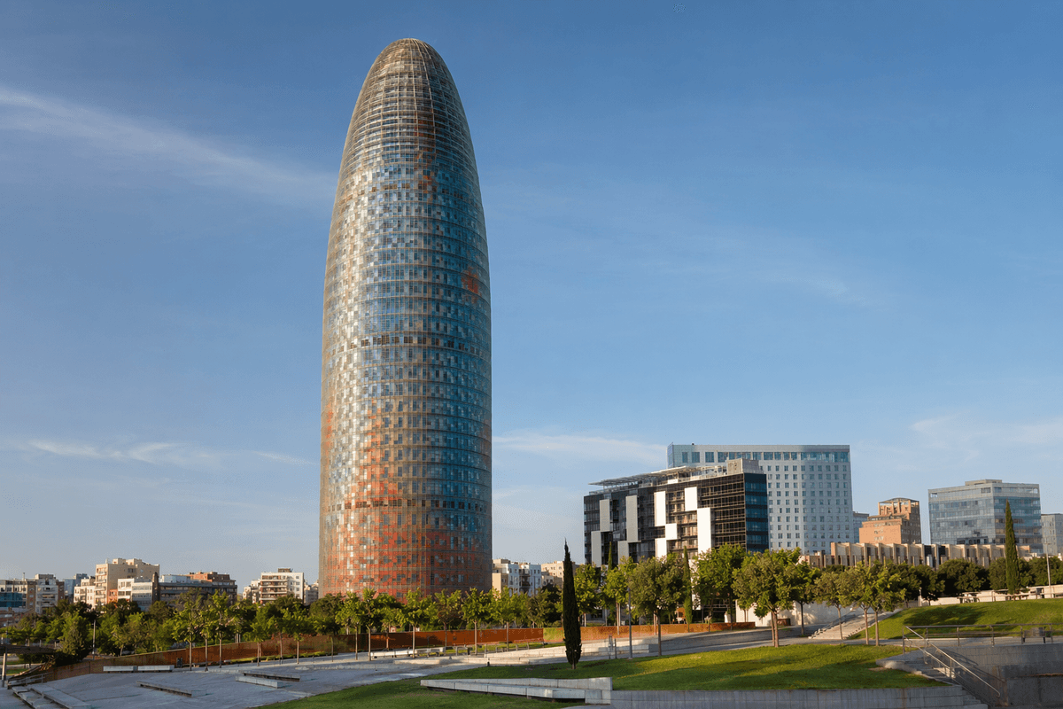
Torre Glories is a office tower in Barcelona, Spain, known for its bullet-like tower form and colored glass skin.
why it matters
Torre Glories helps readers connect Contemporary to visible design decisions: rounded tower profile, colored facade pixels, urban marker at Glories.
what to notice
explore by place and style
map notes
Use the coordinates as anchors for reading the buildings in relation to streets, water, skyline, and nearby landmarks.
41.4036, 2.189441.3875, 2.175348.9244, 2.0286Map coordinates are listed with provider attribution handled through the source records.
architecture guide
A fuller reading of the building's history, setting, form, materials, and public role.
Torre Glories is a office tower in Barcelona, Spain, associated with Contemporary Architecture, and completed or begun around 2005. Torre Glories is a office tower in Barcelona, Spain, known for its bullet-like tower form and colored glass skin. The strongest first reading connects the familiar public image with the physical decisions behind it: rounded tower profile, colored facade pixels, urban marker at Glories, glass, aluminum, concrete, and the way the building meets its setting. Torre Glories is approached as a rounded urban marker, where color, height, and smooth profile make it stand apart from Barcelona's street grid. That combination of location, program, material, and public memory is what keeps the work from becoming only a photograph or a name on a checklist.
Arrival changes the reading before the entrance is reached. Torre Glories is framed by movement, weather, ground level, nearby streets, and the expectations created by earlier images. In Barcelona, those conditions matter because the project has to operate as an address as well as an icon. In Barcelona it marks a newer business district and creates a contemporary counterpoint to the city's better-known Modernisme landmarks. Its coordinates, 41.4036 and 2.1894, place the work inside a real urban field with routes, edges, views, and neighboring activity. Start by watching how the building announces itself from a distance, how it handles approach, and how quickly its familiar silhouette breaks into smaller architectural parts once you stand close to it.
The form of Torre Glories can be described simply, but it should not be flattened into a single silhouette. Its form is a bullet-like office tower with a rounded top, colored facade pixels, layered skin, and a strong vertical presence at Glories. The most memorable buildings usually have a clear diagram that can be remembered after one glance, yet they also contain enough contradiction to reward repeated looking. Here the key visual clues are rounded tower profile, colored facade pixels, urban marker at Glories. Those details show where the building wants attention, how it controls profile, how it creates rhythm, and how it balances repetition with exception. If the first impression feels immediate, keep looking. The second reading usually reveals the compromises, adjustments, and spatial sequences that made that first impression possible.
Structure is not only an engineering problem. It decides what can be open, what must be solid, what can float, and what has to touch the ground. The building's public effect depends on tower core, envelope layers, and a facade system that turns environmental skin into visual identity. For Torre Glories, that structural reading explains why its image is hard to replace with a generic building of the same program. The relationship between support and expression is especially important: some buildings hide their load paths, while others turn them into the main visual language. Instead of stopping at beautiful, strange, tall, or famous, ask what physical system makes the visual effect possible and where the design allows that system to be seen.
Materials give Torre Glories its close-range intelligence. The primary palette includes glass, aluminum, concrete, but the list alone is not enough. Glass, aluminum, concrete, colored panels, night lighting, and reflected sky make the tower shift between object and screen. A material can appear heavy from one side and light from another; it can become reflective, matte, rough, transparent, warm, cold, or symbolic depending on time of day and viewing distance. The surface should be read as an active participant in the design. Look for seams, joints, weathering, reflections, shadows, and changes in color. These details often explain why a building looks convincing in person even when a small photograph flattens it. Material choices also reveal the project's era, construction method, budget logic, and attitude toward permanence.
Torre Glories matters because it has a public role beyond its floor plan. Torre Glories helps readers connect Contemporary to visible design decisions: rounded tower profile, colored facade pixels, urban marker at Glories. That role may be cultural, symbolic, infrastructural, commercial, religious, touristic, or several of those at once. In Barcelona it marks a newer business district and creates a contemporary counterpoint to the city's better-known Modernisme landmarks. A city does not absorb a landmark passively. People use the building as a meeting point, a background, a controversy, a memory device, and a way to explain the district to outsiders. The surrounding streets also push back: traffic, water, plazas, neighboring facades, and skyline views can strengthen or weaken the architectural idea. The useful city question is concrete: did this building clarify a route, intensify tourism, create a public room, alter the skyline, or give a neighborhood a new image?
A practical reading of Torre Glories should move through several distances. Start with the long view, where the building becomes a profile. Move to the middle distance, where entrances, structural rhythm, and surrounding public space become visible. Then use the close view, where surfaces and joints reveal the discipline behind the image. Compare it with older Barcelona icons; the tower is most readable as an urban marker rather than a hand-crafted street facade. The best short checklist is rounded tower profile, colored facade pixels, urban marker at Glories. Do not try to see everything at once. Choose one question at a time: how does the building meet the ground, where does it turn a corner, how does it manage light, what does it hide, and what does it insist on showing?
A deeper study should move from evidence to interpretation. Begin with the map position in Barcelona, Spain, then test the public image against rounded tower profile, colored facade pixels, urban marker at Glories. From there, separate four questions: what facts anchor the building, how form and structure work, why the history matters, and what a visitor should notice up close. That sequence keeps Torre Glories readable from several angles and helps a reader check each claim against materials, photographs, credits, and nearby architecture instead of relying on a single familiar view. It also makes weak description easier to spot: if a claim cannot be connected to a visible part of the building, it needs a better example.
Important architecture rarely comes without disagreement. Its meaning involves skyline change, corporate identity, district redevelopment, and whether a singular tower can belong in a city known for lower urban fabric. The arguments around a building are not distractions from architecture; they are often evidence that the building touches real public questions. Cost, authorship, preservation, accessibility, tourism, skyline impact, religious meaning, commercial programming, and construction risk can all become part of the design's life. With Torre Glories, the useful question is not whether debate makes the project good or bad. The useful question is what the debate reveals about the expectations placed on architecture in its time. A landmark often lasts because it can survive admiration, frustration, technical respect, civic pride, and continued scrutiny.
The legacy of Torre Glories is built from repetition. It appears in photographs, travel plans, school lectures, skyline diagrams, postcards, architectural criticism, and casual conversations about Barcelona. Torre Glories remains useful as a case of contemporary Barcelona because it shows the city's architecture extending beyond Gaudi and historic Modernisme. Legacy does not mean the building has stopped changing. Every restoration, new neighboring tower, altered visitor route, climate concern, or shift in public taste changes how people read it. The continuing value is therefore not only historical. It provides a way to talk about how architecture becomes recognizable, how cities choose symbols, and how design decisions made for one moment keep producing meaning later.
The quickest way to understand Torre Glories more deeply is to compare it with related works rather than treating it as a single isolated masterpiece. Compared with The Shard, it is shorter and more object-like, using color and rounded mass rather than splintered height. Useful comparisons include Palau De La Musica Catalana, Villa Savoye. They help readers move across shared questions: iconic silhouette, waterfront setting, structural expression, glass and steel, public memory, unusual form, or the tension between tourism and civic value. Comparison also prevents lazy praise. Once two buildings are placed beside each other, their differences become sharper: one may be more structural, another more symbolic; one may be public and slow, another commercial and spectacular. That comparative habit turns browsing into architectural learning.
Notice the colored facade pixels and rounded top; those elements make the tower recognizable from a distance without relying on ornament. Details are where the building stops being an abstract name and becomes a designed object. For Torre Glories, the important details connect directly to its broader architectural role: Torre Glories helps readers connect Contemporary to visible design decisions: rounded tower profile, colored facade pixels, urban marker at Glories. A visitor should therefore use details as evidence. If a surface seems decorative, ask what it does for light, scale, weather, or orientation. If a structural element seems expressive, ask whether it carries load, frames movement, or simply communicates an idea. If a famous view feels too familiar, find an edge condition or secondary elevation. A final pass should pair rounded tower profile, colored facade pixels, urban marker at Glories with glass, aluminum, concrete, then compare the result with Palau De La Musica Catalana, Villa Savoye. That comparison clarifies whether the detail is structural, symbolic, scenic, or urban. Use that answer to decide which view deserves the longest look. The strongest buildings can survive that slower scrutiny because the small parts keep pointing back to the whole.
continue reading
related buildings
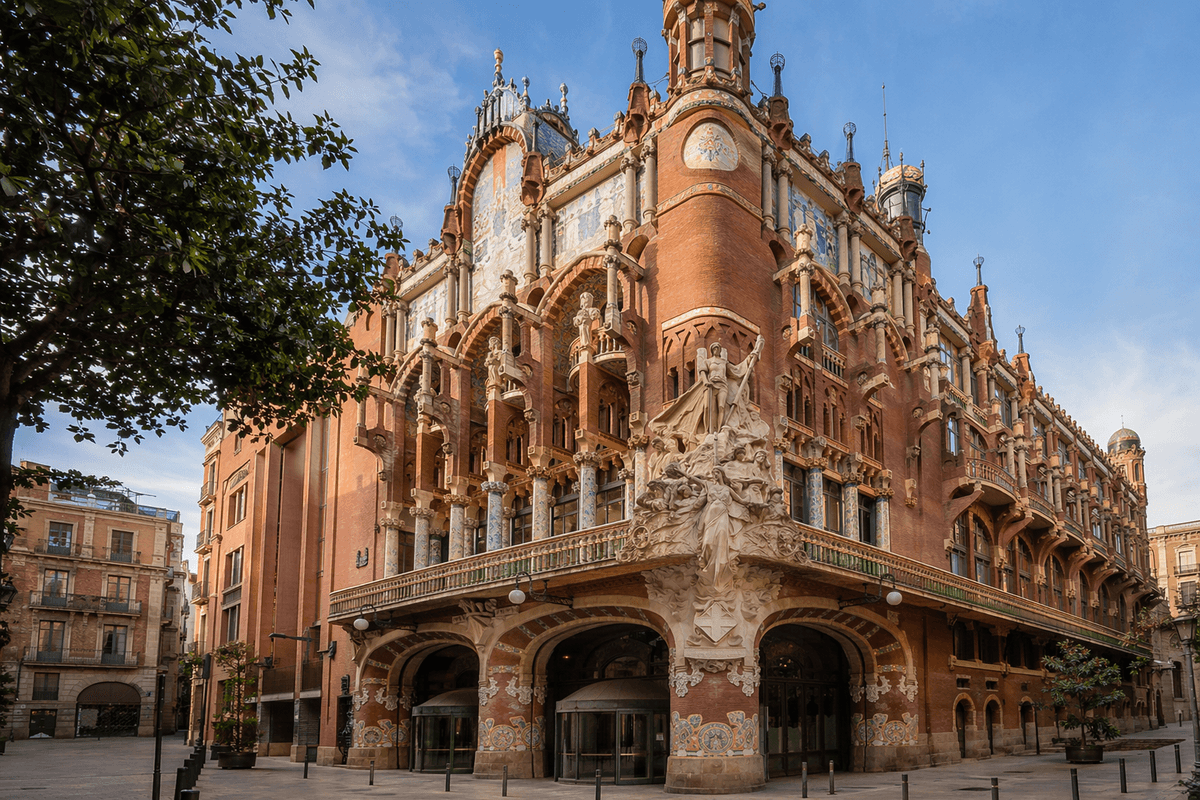
Palau de la Musica Catalana is a concert hall in Barcelona, Spain, known for its colorful Modernisme hall and daylight-filled ornament.
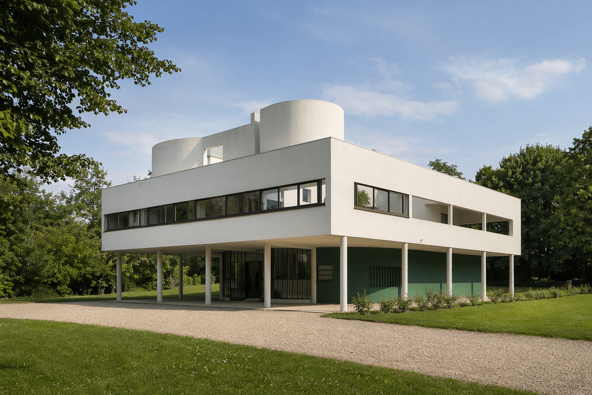
Villa Savoye is a house in Poissy, France, known for its pilotis, roof garden, ribbon windows, and free plan.
References used for facts, location data, image credits, and architectural context on this page.